A Curated Tour: User Interface Improvements
Aries undertakes continuous curation of the Editorial Manager user interface (UI). As a result, users may have noticed a pattern of incremental improvements. In many cases, these changes are so intuitive and natural that you may not have even noticed them! Here are 12 recent UI improvements – which ones did you notice?
Removal of underline
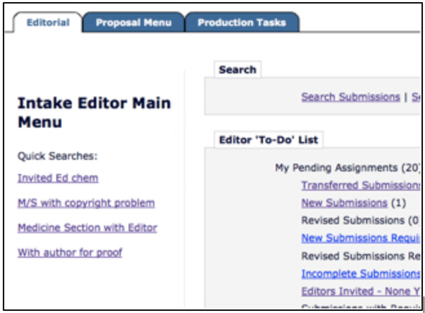
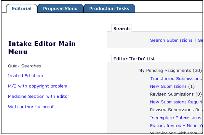
Text in grids looks a lot cleaner. We’ve dropped the underline, signifying hyperlinks with standard royal blue text.
Before:
Now:
Drag and drop
You spoke, we responded! Now you can drag and drop submit, including from third party applications such as Dropbox. See the video: drag and drop upload.
Revision/invited check
No more accidental new submissions at the revision stage. This check also keeps invited submissions with the original invitation data.
Send email icon (Version 12.2)
Convenient e-mail icon appears next to ‘people names.’ This change must be configured in order to take effect.
Before:
Now:
Use of Overlays
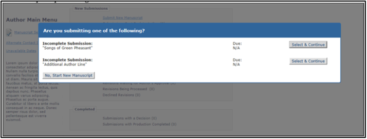
Controlled ‘pop-up’ style experience that is not a new browser window keeps user focused, as the rest of the page deactivates until window is closed.
New button style (Version 12.2)
Lends the interface a clean, modern look.
Before:
Now:
Autocomplete
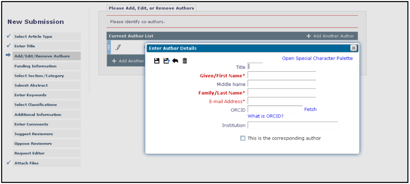
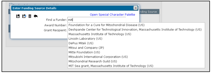
Autocomplete (including acronym mapping) makes entering institution and funder names very simple. For example, MIT maps to Massachusetts Institute of Technology.
Power Grid
A clean, modern, powerful interactive grid that gives users control over which columns are displayed, their order, column width and number of results per page.
Display of reviewer status information
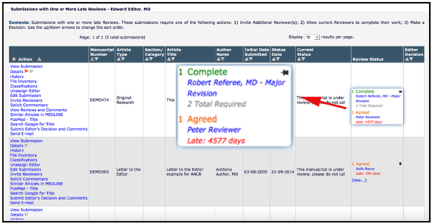
Roll over reviewer status column to see additional detail including who has completed, or declined review, and associated dates and decision terms.


